Release Notes #4 - Option Cards
Posted May 10, 2024Helping users figure out their options
If you’ve used INeedAnA.com/search recently to find abortion providers, you may have noticed a significant new feature. We’re calling them Option Cards, and we’d like to explain a little bit about how they work and why we built them
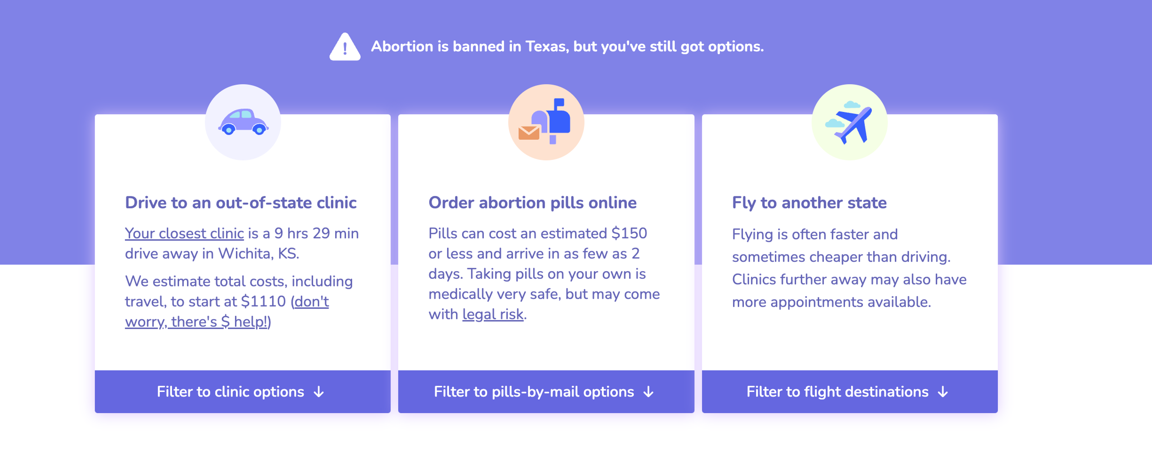
Option Cards are a new way of interacting with provider search results. They describe, in broad terms, the major options users have for accessing abortions. And they are linked to our pre-existing filters to allow users to quickly compare between providers accessible via different methods.
How Option Cards work
Let’s take an example: a user in Houston, Texas trying to find the best abortion provider for them. Their search results will be a mixture of brick-and-mortar providers in Kansas and New Mexico; flight recommendations to Denver, St. Louis and Albuquerque; and telehealth providers that can ship pills to their home. All of these are great options for different users, but each comes with significant differences in cost and experience.
Our Option Cards provide an easy way to compare these different experiences before users delve into the specifics of different providers. We provide a snapshot of cost, how much time it will take, and the legal risk of self-managing an abortion. Then we connect these cards to our pre-existing filters so that if a user knows they want to drive out of state, they can quickly filter out providers that don’t meet their needs.
We show different Option Cards to different users depending on what abortion options are available to them. A user far away from a major airport won’t see our Flights Option Cards, and users in states where abortion is less restricted will get different content on their Option Cards.
Why Option Cards matter to users
Our new Option Cards are a great example of how we think about designing tools for abortion seekers. We want to balance two competing needs. We want to provide as little friction as possible to users so that they can more quickly get to the information they need. At the same time, we don’t want to overwhelm users by blasting them with information that isn’t relevant to them. We think Option Cards are a great step toward meeting both of those needs.
Users are free to browse the unfiltered search results, and they are still only required to enter a location (that we don’t store) in order to get valuable information. But by carefully designing our content and inserting the Option Cards above the search results, we allow users to more easily find the information most relevant to them without forcing them to fill out a questionnaire or read pages of research.
So far the feedback we’ve received from users and advocates has been almost uniformly positive. But we’d love to hear your opinion. If you’ve used ineedana.com/search recently and experienced the Option Cards, please let us know what you think.
